A gorgeous visualization of 200 years of immigration to the US

*Two things I like very much here: data visualization and context. This is a very cool, interactive way to see how immigrants have come to the U.S., from all over the world. I provides good context for immigration discussions and paints a picture of American identity. VL
By Dara Lind, Vox
It’s easy now to assume that Mexico has always been among the main sources of immigration to America. But as this wonderful chart by Natalia Bronshtein shows, that’s not even close to true.
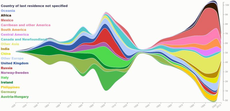
Bronshtein pulled 200 years of government data to put together the visualization. There’s an interactive version on her website: you can hover over any color, at any point, and see the exact number of immigrants who became residents from that country in that decade.
Click HERE to read the full story.
[Photo courtesy of Vox]